
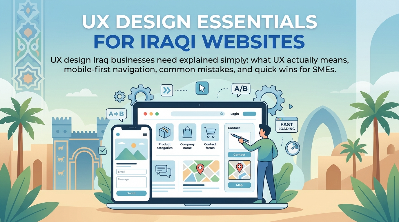
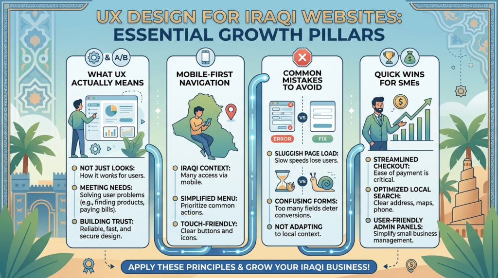
Ask a room full of Iraqi marketing managers what UX design means, and most will describe something adjacent to visual design — colors, fonts, layout. UX design is actually about something more fundamental: whether a visitor can accomplish what they came to do, quickly and without frustration. UX design Iraq businesses invest in properly is the difference between a site that looks good in a portfolio and one that actually turns visitors into customers.
This guide covers what UX design genuinely means beyond aesthetics, how navigation and information architecture shape whether visitors find what they need, what designing specifically for Iraq’s mobile-first audience requires, the common UX mistakes that quietly undermine otherwise solid websites, and simple, practical wins any Iraqi SME can implement without a full redesign. Whether you’re a marketing manager evaluating a current site or planning a new one, this guide is built to make UX something concrete you can actually act on.
What UX Design Means Beyond Aesthetics?
Usability Is the Actual Foundation
User experience design at its core is about usability — can a visitor accomplish their goal on a page without confusion, excessive effort, or frustration? A beautifully designed page that makes it hard to find pricing information or contact details has failed at UX regardless of how polished it looks, because usability, not visual appeal, is the actual measure of whether design is working.
The Difference Between UI and UX
User interface (UI) design covers the visual and interactive elements — buttons, colors, typography, layout. UX design encompasses the broader experience: how intuitive the navigation feels, whether the page loads quickly enough to hold attention, whether the overall journey from arrival to action feels effortless or effortful. Good UI without good UX still fails visitors; the two need to work together.
Why This Matters for Conversion, Not Just Satisfaction?
Poor UX doesn’t just create a mildly annoying experience — it directly costs conversions. A visitor who can’t quickly find how to contact a business, or who abandons a confusing form partway through, represents a lost inquiry that better UX design would have captured. Website usability improvements often produce measurable conversion increases without requiring any change to the underlying product or service being offered.
A Practical Example of UX’s Real Impact
Consider a Baghdad-based dental clinic with an attractive website that nonetheless struggled with low online booking rates. A closer look revealed the booking button was styled subtly to match the site’s minimalist aesthetic, making it easy to overlook, and the booking form asked for insurance details and medical history before a visitor had even confirmed availability — information most visitors weren’t ready to provide at that stage. Simplifying the initial form to just name, phone number, and preferred time, and making the booking button visually distinct, increased completed bookings substantially within weeks, without any change to the clinic’s actual services. This is what UX design Iraq businesses invest in properly delivers: the same traffic converting at a meaningfully higher rate.
Navigation & Information Architecture
Structuring Navigation Around How Customers Think
Navigation menus organized around internal company structure — departments, service categories that make sense internally but not to an outside visitor — consistently confuse visitors more than navigation organized around how customers actually think about their own needs and questions.
The Three-Click Guideline as a Starting Point
While not an absolute rule, the general principle that a visitor should be able to reach any important page within roughly three clicks from the homepage is a useful benchmark for evaluating navigation depth. Sites requiring visitors to click through multiple layers of menus to find basic information — services, pricing, contact details — lose visitors along the way.
Breadcrumbs and Orientation
For sites with any real depth — multiple service categories, blog content, product catalogs — breadcrumb navigation helps visitors understand where they are within the site structure and provides an easy path back to broader categories, reducing the disorientation that causes visitors to leave rather than continue exploring.
Designing for Iraq’s Mobile-First Users
Touch-Friendly Interaction as a UX Requirement
Given how much Iraqi traffic arrives via mobile, UX design has to account for touch interaction specifically — adequately sized tap targets, navigation that works naturally with thumbs rather than precise mouse clicks, and forms that don’t require excessive typing on a small keyboard.
Designing for Interrupted, On-the-Go Browsing
Mobile browsing frequently happens in shorter, more interrupted sessions than desktop browsing — a visitor checking a business’s hours while out, or comparing options while waiting somewhere. UX design that assumes long, focused browsing sessions doesn’t serve this reality well; the most critical information and actions need to be immediately accessible, not buried several steps into a longer journey.
WhatsApp Integration as a UX Consideration?
Given how central WhatsApp is to how Iraqi customers actually initiate contact, integrating a direct WhatsApp link prominently isn’t just a marketing nicety — it’s a core UX decision that respects how visitors actually prefer to communicate, rather than forcing them into a contact form that doesn’t match their expectations.
Common UX Mistakes
Burying the Call to Action
A clear, visible call to action on every important page — even something as simple as a prominent phone number or WhatsApp button — should never require scrolling to find. Pages that make visitors hunt for how to actually take the next step lose conversions that better placement would have captured.
Inconsistent Navigation Across Pages
Navigation that changes structure or behaves differently across different sections of a site creates confusion and erodes trust, since visitors build a mental model of how a site works and inconsistency breaks that model repeatedly.
Forms That Ask for Too Much Too Soon
Contact or inquiry forms demanding extensive information before a first conversation happens create unnecessary friction. Starting with minimal required fields and gathering additional detail later in the relationship consistently produces more completed inquiries than a long, demanding initial form.
A Quick UX Mistakes Checklist
- Calls to action visible without scrolling on every important page.
- Consistent navigation structure and behavior across the entire site.
- Forms requesting only essential information upfront.
- Clear visual hierarchy guiding attention to the most important content first.
Simple UX Wins for SMEs
Quick Wins That Don’t Require a Full Redesign
Adding a visible WhatsApp button, simplifying an overly long contact form, reordering navigation to match how customers actually search for services, and ensuring the primary call to action appears above the fold on both desktop and mobile are all improvements that can be implemented without a comprehensive redesign, often producing meaningful results relatively quickly.
How to Improve Website User Experience Without a Big Budget?
Businesses asking how to improve website user experience in Iraq on a limited budget should prioritize the changes with the clearest connection to actual conversion — contact accessibility, navigation clarity, mobile usability — before investing in purely visual refinements that matter less to whether visitors actually complete their goal. This prioritization is the practical heart of any effective UX design Iraq SME can execute without a large redesign budget.
Testing With Real Users
Even informal testing — watching a handful of people unfamiliar with the site try to complete a common task, like finding pricing or submitting an inquiry — often reveals usability issues that internal review misses, since people who built the site already know where everything is and can’t easily see it through a first-time visitor’s eyes.
Creative 4 All builds UX design services into every project as a core discipline, not an afterthought layered on top of visual design, working alongside our SEO team since strong usability and search performance reinforce each other directly.
Read More on the Web Design Blog — or subscribe for future insights on building websites that genuinely work for Iraqi users.
FAQs
UI design covers visual and interactive elements like buttons and layout. UX design covers the broader experience of using the site — navigation, usability, and how effortlessly a visitor can accomplish their goal.
Not necessarily. Many of the highest-impact UX improvements — clearer navigation, accessible contact information, simplified forms — cost little to implement and often matter more than expensive visual customization.
Signs include high bounce rates on key pages, declining inquiries despite steady traffic, and visitors seeming to struggle finding basic information like pricing or contact details. Testing with real users unfamiliar with the site often reveals issues quickly.
Yes, meaningfully. Touch interaction, shorter browsing sessions, and different context (often on the go) mean mobile UX needs distinct consideration rather than simply shrinking a desktop-optimized design.
Often, yes. Targeted improvements — simplifying forms, improving navigation clarity, adding accessible contact options — can meaningfully improve usability without requiring a comprehensive rebuild.