
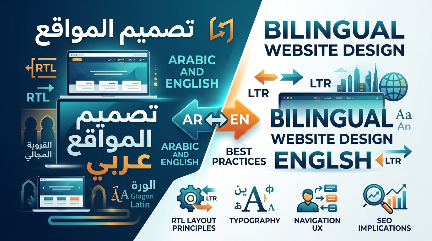
Most guides to building an Arabic website amount to “flip the layout and translate the text,” which is exactly the mindset that produces the awkward, half-considered bilingual sites so common across the region. Genuine bilingual website design requires treating Arabic as its own design language with its own typography, layout logic, and user experience conventions — not a mirrored, translated copy of an English site built for a completely different reading direction and cultural context.
This guide covers what actually separates thoughtful bilingual design from a rushed translation job: the real principles behind right-to-left (RTL) layout, Arabic typography considerations that get overlooked constantly, how navigation and UX need to adapt across two languages, and the SEO implications of hreflang implementation that connect directly back to how well the design itself was executed. If you’re planning a bilingual site, or evaluating whether your current one is falling short, this guide is built to name exactly what genuine bilingual website design requires.
Why Bilingual Design Is Different From Translation?
Translation Handles Words; Design Handles Everything Else
Translating text from English to Arabic addresses only the words on the page — it says nothing about whether the layout, visual hierarchy, and interaction patterns built for a left-to-right, English-reading audience will feel natural to an Arabic reader navigating the same content right-to-left. Arabic website design done properly starts from how Arabic readers actually scan and process a page, not from adapting an English template after the fact.
The Cost of Treating Arabic as an Afterthought
A site where the English version received real design attention and the Arabic version was produced by mirroring the template and swapping in translated text almost always shows — awkward spacing, misaligned icons, typography that wasn’t chosen with Arabic script in mind. Visitors notice this inconsistency even without being able to articulate exactly what feels off, and it quietly undermines the credibility a bilingual site is supposed to build.
A Practical Example of This Gap
Consider an Iraqi law firm that launched an Arabic version of its site by mirroring its English template and translating the copy. The English site’s icons, originally chosen without RTL in mind, ended up pointing the wrong direction once mirrored — a “read more” arrow now pointed away from the content rather than toward it, and a step-by-step process diagram read visually backward for Arabic users even though the text itself was correctly translated. None of this broke the site technically, but it created a subtle sense that the Arabic version was a lower priority than the English one — exactly the impression a bilingual site is meant to avoid. This is the practical cost of treating bilingual website design as a translation task rather than a genuine design process.
Designing Both Languages With Equal Intention
The strongest bilingual sites are designed with both languages in mind simultaneously from the earliest concept stage, rather than designing for one language and retrofitting the other. This doesn’t necessarily mean identical visual treatment — it means each language version receives genuine design consideration appropriate to how it’s actually read and used.
RTL Layout Principles
The Full Layout Mirrors, Not Just Text Direction
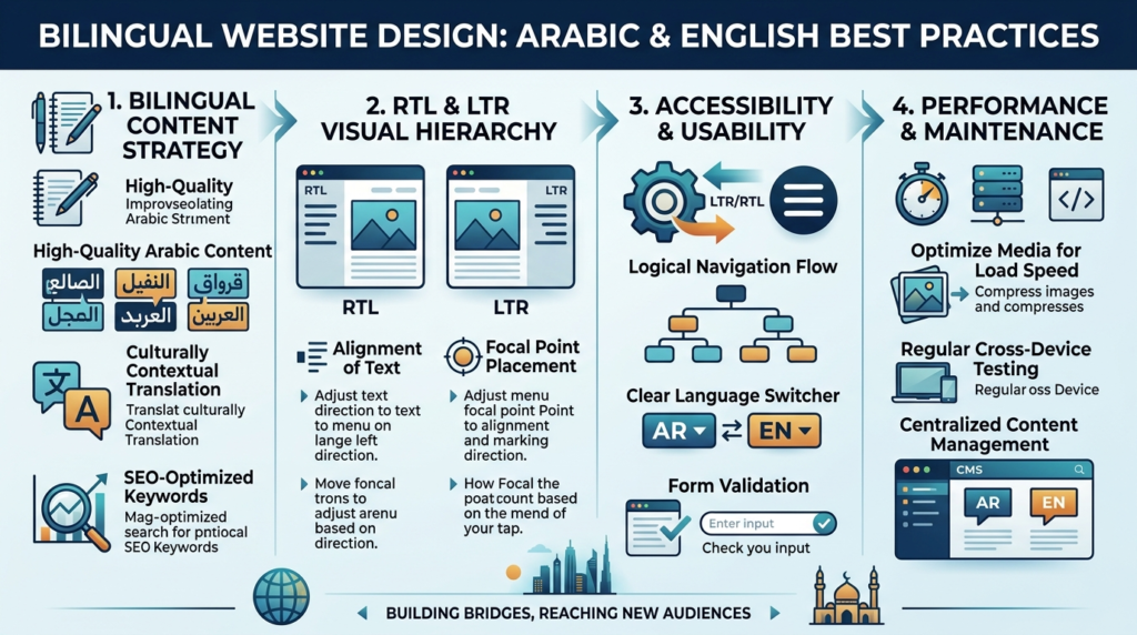
Right-to-left layout means far more than text flowing from right to left — navigation menus, breadcrumbs, form field order, icons implying direction (like arrows or “next” buttons), and even progress indicators typically need to mirror as well, so the entire interface reads coherently in the RTL direction rather than mixing RTL text with LTR interface conventions.
Icons and Directional Elements
Icons that imply direction — a “back” arrow, a “forward” chevron, a progress bar filling left to right — need genuine reconsideration for RTL, not just repositioning. An arrow pointing right that meant “next” in the English version needs to point left in the Arabic version to preserve the same meaning within a right-to-left reading flow.
Testing RTL on Real Devices, Not Just Toggling a Setting
Many website builders offer an RTL toggle that handles basic text direction automatically, but genuinely testing the RTL experience on actual devices frequently reveals inconsistencies the automatic toggle didn’t catch — particularly in custom components, forms, and third-party embedded elements that weren’t built with RTL in mind.
Arabic Typography Considerations
Choosing Fonts That Actually Support Arabic Well
Not every font that claims Arabic support renders it with the same quality as its Latin character set — some Arabic web fonts look cramped, poorly weighted, or simply unattractive compared to genuinely well-designed Arabic typefaces. Selecting a font family specifically evaluated for Arabic quality, rather than assuming any font with Arabic glyphs is adequate, meaningfully affects how professional the Arabic site feels.
Line Height and Spacing Differences
Arabic script often requires different line height and letter spacing than Latin text to remain comfortably readable, since Arabic letterforms and diacritical marks behave differently than Latin characters. Applying identical spacing values across both language versions frequently makes Arabic text feel cramped even when the English version looks perfectly fine.
Font Size Perception Differences
Arabic and Latin text at the same pixel size don’t always feel visually equivalent in size or weight to readers, given differences in letterform structure. Testing actual readability with native Arabic readers, rather than assuming numerically identical font sizes produce an equivalent experience, catches this kind of subtle but real usability gap.
Navigation & UX for Two Languages
Language Switching That Actually Works Well
A language switcher should be easy to find, clearly labeled, and should ideally take a visitor to the equivalent page in the other language rather than defaulting to the homepage, which is a common and frustrating shortcut that loses a visitor’s place in the site.
Content Structure Doesn’t Have to Be Identical
Navigation labels, content organization, and even page structure sometimes benefit from genuine adaptation between languages rather than a rigid one-to-one match, since how Arabic-speaking and English-speaking visitors search for and expect to find information can differ meaningfully, particularly for Iraq-specific content.
Forms and Interactive Elements
Forms need RTL-aware field ordering, and validation messages, placeholder text, and error states all need proper Arabic translation and RTL formatting — not just the visible labels. A form that looks correctly translated but breaks RTL conventions in its interactive states creates a jarring experience right at a critical conversion point.
SEO Implications (hreflang)
Why Design Quality Directly Affects SEO Here?
A poorly executed RTL experience increases bounce rate and reduces engagement on the Arabic version, which are signals Google’s systems factor into how that version performs over time — meaning genuine RTL website design quality isn’t just a UX nicety, it has real downstream SEO consequences. This connection between design and rankings is often underestimated, since teams treat design polish and SEO performance as separate workstreams rather than directly linked outcomes.
Implementing hreflang Correctly
hreflang tags tell Google that the English and Arabic versions of a page are language alternatives of the same content, not duplicate or competing pages. Getting this right technically matters, but it only delivers its full value when the Arabic version it points to is genuinely well-designed — hreflang correctly connects two pages, but it can’t compensate for one of them being a poor user experience. A technically correct hreflang setup pointing to a poorly designed Arabic page still results in that page underperforming once visitors actually land on it.
Creative 4 All builds bilingual website design services around genuine RTL and Arabic-first design consideration, coordinated closely with SEO implementation so hreflang, content strategy, and design quality reinforce each other rather than being handled as disconnected steps.
Request a Free Audit to see how your current bilingual site — or your plans for one — measure up against genuine RTL and Arabic design best practices.
FAQs
Basic text direction can often be toggled automatically, but genuine RTL design — mirrored icons, appropriate typography, tested interactive elements — requires deliberate design attention beyond a single setting.
Not necessarily. While brand consistency matters, each language version benefits from design consideration appropriate to how it’s actually read and used, which sometimes means meaningful rather than purely cosmetic differences between versions.
Yes. Visitors notice when a site feels awkward or poorly considered, even without being able to name exactly why, and this quietly undermines the credibility a professional bilingual site is meant to project.
Test on real devices with native Arabic readers, not just by toggling an RTL setting and glancing at the result. Automatic RTL toggles frequently miss issues in custom components, forms, and third-party embedded elements.
hreflang correctly tells Google that two pages are language alternatives, but if the Arabic version has a poor RTL experience, higher bounce rates and lower engagement on that version can undermine its performance regardless of correct technical hreflang implementation.