

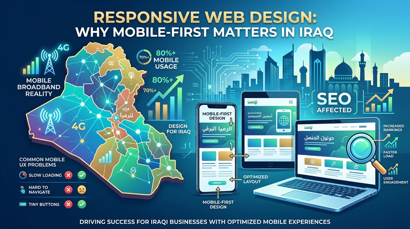
If a website isn’t genuinely built mobile-first, it’s failing the majority of visitors who will ever encounter it in Iraq. According to DataReportal’s Digital 2026 report on Iraq, 50.8 million cellular mobile connections were active in the country as of late 2025 — 108 percent of the total population — and GSMA Intelligence data cited in the same report indicates that 86.2 percent of those mobile connections now qualify as broadband, meaning they connect via 3G, 4G, or 5G networks. Responsive web design Iraq businesses invest in isn’t a nice-to-have refinement; it’s the baseline requirement for reaching the overwhelming majority of the market.
This guide covers what the data actually shows about Iraq’s mobile-first reality, what responsive design genuinely means beyond the marketing buzzword, the specific mobile UX failures that quietly cost businesses customers, how to actually test a site’s mobile performance, and why all of this directly affects SEO rankings, not just user experience. If your site was built years ago with desktop as the primary assumption, this guide is built to show you exactly what’s likely going wrong and why it matters more than it might seem.
Iraq’s Mobile-First Reality (Verified Data)
The Numbers Behind the Claim
DataReportal’s Digital 2026 report, produced with Kepios, confirms that mobile connections in Iraq (50.8 million) exceed the country’s total population (47.3 million), reflecting how common it is for individuals to maintain multiple SIMs or devices. Of those connections, GSMA Intelligence data suggests 86.2 percent now qualify as mobile broadband — up from 82.9 percent reported roughly a year earlier — indicating that access to faster mobile networks continues to expand meaningfully year over year.
An Important Caveat on What “Broadband” Means
DataReportal is explicit that broadband classification reflects network capability, not confirmed internet usage — some subscription plans classified as broadband may only include voice and SMS access, so this figure shouldn’t be read as a precise measure of how many people are actively using mobile data. Even accounting for this caveat, the scale and direction are unambiguous: mobile network capability in Iraq is both extensive and growing.
What This Means Without the Statistics?
Strip away the methodology notes and the practical reality is straightforward: most people who will ever visit an Iraqi business’s website are doing so on a phone, over a mobile network, and that share of the market continues to grow rather than shrink. A site not genuinely built for that reality is optimizing for a shrinking minority of its actual audience.
A Practical Example of the Stakes
Consider a Baghdad-based law firm whose website was built primarily for desktop, with mobile support added later as an afterthought. Analytics revealed that over 70 percent of visits arrived via mobile, yet the mobile experience — cramped navigation, a contact form that was difficult to complete on a small screen — converted at roughly a third of the desktop rate. The firm wasn’t losing potential clients because its services were unappealing; it was losing them because the majority experience of its own website actively worked against conversion. Rebuilding with a genuine mobile-first approach closed most of that gap within a few months, without any change to the underlying legal services being marketed. This is the practical cost of treating responsive web design Iraq businesses need as optional rather than foundational.
What Responsive Design Actually Means?
Beyond “It Resizes on Different Screens”
Responsive design is often reduced to the technical fact that a layout resizes for different screen dimensions, but genuine responsive design goes further: touch-friendly button and link sizing, text that’s legible without zooming, images that load efficiently on mobile networks, and navigation that works naturally with touch rather than being a shrunken version of a desktop menu. A site that technically resizes but remains awkward to actually use on a phone hasn’t achieved real responsive design.
Mobile-First as a Design Philosophy, Not Just a Technique
Mobile-first design means starting the design process with the mobile experience as the primary consideration, then adapting up to larger screens — rather than designing for desktop first and shrinking the result down afterward. This ordering matters because it forces prioritization: content and functionality that doesn’t fit comfortably on a small screen gets reconsidered rather than simply compressed.
Breakpoints and Real-World Testing
Responsive breakpoints — the specific screen widths where a layout adjusts — need to be tested against the actual range of devices Iraqi visitors use, not just the handful of standard sizes a design tool defaults to. A layout that looks fine at a designer’s chosen breakpoints can still break awkwardly on the specific mid-range Android devices that make up a large share of actual Iraqi mobile traffic.
Common Mobile UX Failures
Text Too Small to Read Without Zooming
Body text sized for a desktop screen often becomes uncomfortably small on mobile, forcing visitors to zoom in — a small friction that measurably increases the likelihood of abandoning the page rather than continuing to read.
Buttons and Links Too Close Together
Touch targets that work fine with a precise mouse cursor become frustrating on a touchscreen when they’re too small or too close to adjacent elements, leading to mis-taps that damage the overall experience even when the underlying content is exactly right.
Slow-Loading Images and Heavy Pages
Desktop-sized images served without mobile-appropriate compression slow page loading significantly on mobile networks, and given how much of Iraq’s mobile-first website traffic depends on mobile broadband rather than fixed connections, this directly costs visitors who won’t wait for a heavy page to finish loading.
A Quick Mobile UX Checklist
- Body text readable without pinch-zooming on a standard mobile screen.
- Buttons and links sized and spaced appropriately for touch interaction.
- Images compressed and sized appropriately for mobile network conditions.
- Forms usable on a small screen without excessive typing or scrolling.
Testing Your Site’s Mobile Performance
Why Simulators Aren’t Enough?
A browser’s built-in responsive design simulator is a useful starting point, but it runs on a fast office network and doesn’t accurately replicate real mobile network conditions or actual device behavior. Testing on an actual phone over an actual mobile connection catches usability and speed issues that a desktop-based simulator consistently misses.
Using Google’s Testing Tools
Google’s PageSpeed Insights and Core Web Vitals reports provide mobile-specific performance scores directly, highlighting exactly which elements are slowing mobile loading and which usability issues Google’s own crawlers have flagged. These tools should be checked specifically for mobile scores, not just an overall or desktop-weighted average.
Real User Monitoring Over Time
Beyond one-time testing, tracking actual mobile visitor behavior in analytics — bounce rate, time on page, conversion rate specifically for mobile traffic — reveals whether real-world mobile performance matches what testing tools suggest, since actual user behavior is the ultimate measure that matters.
Why It Affects SEO?
Mobile-First Indexing
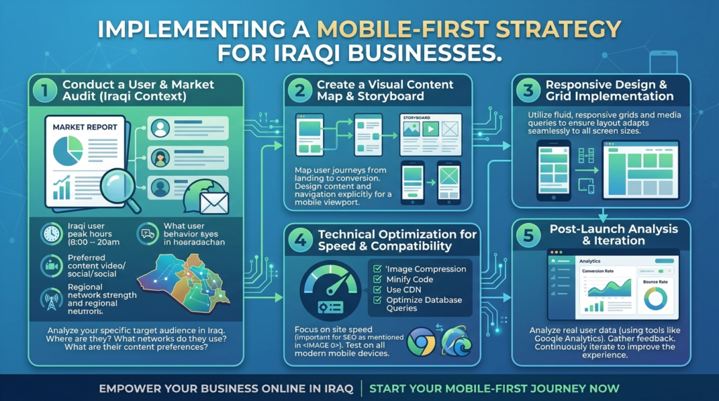
Google predominantly uses the mobile version of a site’s content for indexing and ranking, which means a site with a poor or incomplete mobile experience is being evaluated on that weaker version, regardless of how strong the desktop experience might be. Responsive web design Iraq sites lack directly undermines SEO performance, not just user experience.
Core Web Vitals as a Ranking Factor
Mobile page speed and stability, measured through Core Web Vitals, factor directly into Google’s ranking systems. A site that loads slowly or shifts unexpectedly on mobile devices faces a real ranking disadvantage independent of content quality, making mobile performance a technical SEO priority rather than a purely aesthetic consideration.
The Compounding Cost of Getting This Wrong
A site with weak mobile design loses visitors to poor experience, loses ranking potential through weaker Core Web Vitals and mobile-first indexing, and loses credibility with visitors comparing it against better-optimized competitors — three compounding costs from a single underlying gap.
Creative 4 All builds every project around genuine responsive design services as standard practice, not an optional upgrade, as part of comprehensive web design and development engagements built for how Iraqi users actually browse.
Request a Free Audit to see exactly how your current site performs on mobile, and what specific improvements would have the biggest impact.
FAQs
Not necessarily. Visual resizing is only part of genuine responsive design — touch-friendly interaction, mobile-appropriate loading speed, and real usability on actual devices matter just as much as whether the layout technically adjusts.
According to DataReportal’s Digital 2026 report, mobile connections in Iraq (50.8 million) exceed the total population, with GSMA Intelligence data indicating 86.2 percent of those connections now qualify as mobile broadband — reflecting an overwhelmingly mobile-first market.
Yes. Google predominantly uses the mobile version of a site for indexing and ranking, and Core Web Vitals — which measure mobile speed and stability — factor directly into ranking systems, making mobile performance a genuine SEO factor, not just a UX consideration.
Test the site on an actual phone over an actual mobile connection, and check Google’s PageSpeed Insights for mobile-specific scores rather than relying solely on a desktop browser’s resize simulation.
It depends on severity. Isolated issues like image compression or button sizing can often be fixed without a full redesign, but a site with widespread mobile usability problems across navigation, speed, and layout usually benefits from a more comprehensive mobile-first rebuild.